Monday, December 31, 2018

New Year's Day ... The Magician (CG character development on steroids)


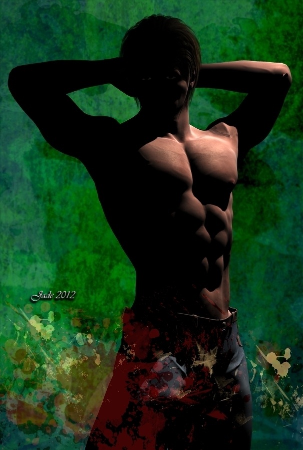
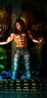
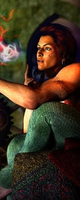
Happy New Year! Yes ... I couldn't resist signing off on something "2019" so ... remember The Conjurer character from last week? The one where I resurrected an old render, combined it with an Amberlight image I did last year, then plunked the result into Serif and worked it up as a show poster? Yes, that's the one. Soooo, I thought --

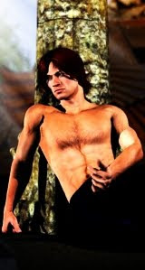
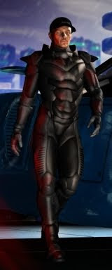
The conjurer is obviously a performer (hence the show poster). Let's organize a performance. The hardest thing was deciding what the act would be, and how to stage it. This is the old Dinokonda, with massively overdriven textures and a lot of painting. Also, the raytrace was put into Photoshop for loads of painting: you might be surprised, even shocked, at how flat, dull and boring the raytraces are. Didn't used to notice it, years ago, but lately, with the vast advances in CG work, especially on the desktop at hobbyist level, you do notice it. So ... Photoshop to the rescue, I guess. Gauss it, add grain, crush the shadows, burn the highlights a bit. The result is far superior.

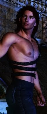
Have also been playing with displacement mapping, as applied to hands:


That's not too bad, actually, but there's a limit to how far you can push a standard displacement map. I'm actually thinking of going back to basics and actually painting a displacement map that puts the veins in a human hand where they ought to be. Sure, you can buy displacement maps from the DAZ store, but they work out at over A$35! If I'm as smart as I think I am, I ought to be able to paint this myself. Worth the experiment, at least.

(Also, there's a limit to how close to the Michael 4 model you can bring the camera. This hand, here, was rendered at about 1000 pixels wide, and the you can actually see the polygons in the curved surfaces, this close up. There just aren't enough polygons in the old model for it to hold together. I painted them out and resized the image smaller, to get this quality.)

Very happy with these renders. Have definitely managed to get rid of the plastic-doll appearance that plagues the old renders. The trick of Gaussian blur and film grain seems to work every time. That's a relief! Am thinking of going back into numerous of the old project files, the really memorable subjects and redoing them. Get clever with the rework. 😃

Sunday, December 30, 2018

CG heroes on a slooow New Year's Eve afternoon...

CG character design in DAZ Studio and Photoshop
Assignment to self: create a still -- maybe a promo shot -- for a movie that doesn't exist. Okay, you take the latest two characters I've created and put them into a scene. They're doing something ... there's a heated discussion going on here. A chest, a lantern, an ancient brick wall. You want to know what's going on here! I do like these characters ...


...the one on the right is wearing a cushion cover we used to have some years ago, LOL. I took a photo of it, something like 2011, and it's still in my textures folder. Couldn't resist.

Once again, a tiny bit of Gaussian blur (0.3, on an image that's 2000 pixels wide is just fine), and a tiny bit of film grain to "knock the edge" off the too-too-sharp digital render. Then I blasted the gamma way down and cranked up the contrast, which has the effect of crushing the shadows, which is something the eye is so accustomed to in genuine photography, you expect it. It all adds to the illusion that this isn't a render ... or, if you consider this from another angle, it also gives you the ability to squeeze a leetle bit more out of the old raytrace!

In the new year I'll dabble in Lux again. I have three new characters to play with: these two (who look to me like, oh, professional soldiers on a job); and then there's the conjurer from last week. It's going to be interesting  -- very! -- to see how they render up in Lux. Or even if. Fact: some skinmaps look horrible in LuxRender.

Interestingly ... I put a jacket on the older, taller dude for a good reason: Michael 4's elbows look pretty awful when they bend. Looks like you bent a hollow tube till it almost cracked. Ack. This is one reason (I know, I know), to switch to the Genesis figure. One day when I have enough spare cash, I will. Eventually. It won't happen any time soon, so in the meantime, let's just see how clever we can be, getting around the shortcomings of the old system. (Dang -- there was a time what I'm doing now was absolutely state of the art, y'know!) But if you want an irresistible reason for making the change when the cash will accommodate it, consider this catalog shot, at left! Uh huh. That's a skinmap and body morph known as Rex for Genesis 8, wearing the Elan hair, also for Genesis 8, and a whole bunch of costume bits (also for Genesis 8, duh) ... cool. But to get anywhere close to rendering this I'd have to drop a lot of money. We'll just set that date off into the future and have fun with what we got.

If there's one thing I really do appreciate, it's the Genesis 8 hands:


Anyway, gives me something to work towards, doesn't it? And in the meantime --

New Year's Eve is upon us. On this side of the dateline, 2018 has a little over nine hours left to go. I won't be signing off on any more art this year, and the next time I sign something, it'll say say 2019! So --

I'm going to say Happy New Year to all. I need to go and straighten the place up in preparation for a buffet dinner, so ... that's it from me, folks, for 2018!

CG Hero: chasing photorealism

CG character design ... sophisticated render: uploaded at 2000 pixels:
please DO see it full size! 
Chasing photorealism: depth of field, a single light source, film grain, you name it. This guy is pretty impressive, and if I had to make the call ... I do believe this render is a candidate for the best work I've ever been able to wrangle. Sophisticated. Here's a closer look, a detail crop:


It really has the look of a still from a movie. You take a second look and think, "What did I miss?"

I've got ONE light on this scene. Just one. The venous map is on the figure; the face is less than perfect (not pretty: very human -- a new face, designed for this project. Body designed for this project too). The focus is "off" just the tiniest bit, to fool the eye into accepting this as not a digital creation. This time, rather than doing Gaussian blur in Photoshop, in post work, I turned on DOF and did it in the original render --

Not a Lux Render! Just a raytrace ...  not a Genesis figure either. Oooold fashioned Michael 4, in DAZ Studio 3. 😀

Yep. I'll be coming back to this character!

Wednesday, December 26, 2018

Because it's so [bleeping!] HOT ... "The Colors of Winter, Aussie Style"


Boxing Day plus one ... and we're in the middle of a heatwave that's setting records. It's so hot, you can't even think ... and the a/c is running full-throttle, and it's still an oven in here. I'd intended to do art during the holidays -- there's some experiments I want to run in CG, for a start, and a couple of paintings to play with. But, in this heat? [rolls eyes]

On the other hand, I was going through images and stumbled over a collection I put together the winter before last (2017). Uploaded them to facebook or something, never to this blog. And I thought, "Colors of Winter" ... oh, yes. So --

Because it's so bleeping hot, let's do a WINTER photo shoot, and keep the art for another day. Here, have some more while I'm uploading...


Sunday, December 23, 2018

Happy Holidays ... and Peace on Earth


The "card" says it all ... Happy Holidays, folks. Merry "Whatever You're Celebrating," and Happy 2019 to all!

(If anyone is interested: I found a free stock shot of Stonehenge, at the moment when the sun crosses the horizon on the solstice of winter. Into Photoshop; make the canvas size about 2.5x the width of the original photo. Some creative painting to create a smooth fade-to-dark at the top; two Photoshop brushes: the biggest. brightest Christmas star (a bokeh light) right on the sunrise, and snow falling softly. Then, into Serif for typographic art: the font is Glastonbury Wide, in gold color, with 3D emboss and effects set, 3D lights on ... and I adjusted the lights to illuminate the golden message with the sunrise.)

Saturday, December 22, 2018

A hunk, a stag, a stream ... plus Gaussian blur and film grain

CG character design: The Mercenary
The Mercenary -- again. I really like the character, and couldn't resist coming back to him. Wondering about posing him with The Magician ... like, maybe they're in the same place, on the same job? The possibilities are endless and delicious. But --

If there's one thing that "bothers" me about the classic raytrace (which is pretty much where I'm stuck, not being able to outlay several grand on hardware and software at this time, to play catch-up with all the front runners who take Genesis whatever and fabulous render engines for granted...) it's that a raytrace is "too sharp, too clear, too perfect," or something -- an almost indefinable quality that makes even a good picture look fake ... and can make a poorly-rendered character look like a plastic doll, or manikin, perhaps one of those life-like marionettes. The big question being, of course, what can you do about this as a work-around?

So I'm starting to play with film grain and Gaussian blur, to introduce a kind of imperfection to the image, to sort of "knock the edge off the digital perfection," which might fool the eye into seeing a human being instead of a piece of plastic. Here's a detail crop to give a better look at this:

Gaussian blur and film grain added to a CG render
Gaussian blur and film grain were added in Photoshop (I imagine Krita has the filters too, but I confess, I haven't even looked for them yet: am still learning to handle the brushes there). Just enough film grain to knock the edge off the digital perfection ... just enough Gaussian blur to fool your eye into believing a camera took this shot. Raw CG renders with DOF left off are ... just too much in-focus to look real! (This character has also been over-painted with beard shadow, body hair, and a bit of work done on the wind-whipped head-hair ... same reason. The raw model (Michael 4, wearing face and body designed by me) is just too plastic to convince, or please, anyone much today, in the wake of the aforementioned Genesis and fabulous unbiased render engines. (Anybody remember Captain Scarlet and Captain Blue? No, not the more recent digital animation, the 1960s production. Yeah, that one ... did I just date myself??)

Also in this render, I've overdriven the bump maps on everything to heap texture into the shot; the only thing I didn't do was turn on DOF. Technically I should have; but if you just spend twenty minutes over-driving the bump values, then turn on depth of field and the background blurs out, why bother with the bump maps? So in this one I went for texture; in the next one, I'll play with DOF.

Also been painting in Photoshop and Krita. This first one is a digital watercolor done from a photo that was such crap, it belonged in the bin -- but it was the only one where the framing and composition were perfect! So, naturally, the automatic light metering gave me a washed-out photo in pale grays and no real color, and blurred the hell out of it into the bargain. The camera konfooz itself. (My bad: I "cooked" it in a veryveryvery hot car. I think I halfway killed it. Sound of sighing.) So the assignment was, can you take a garbage photo, derive the sketch and wind up with a very nice painting? And the answer is, yes, you can:

Digital watercolor in Photoshop
Please do have a look at that, large size (I uploaded it at 1600 wide) ... am very proud of the fine work. This was produced 90% in Photoshop, with just a tiny bit of painting done in Krita (because it has a brush that Photoshop doesn't; if you have the right .abr brushes in your Photoshop, you could do the whole thing in Photoshop).

Then, this one below is the reverse: 95% done in Krita, with just a little bit of work done in Photoshop for the same reason: a specific brush I wanted to use:

Krita painting: something like oils or acrylic
This one (Stag at Dawn) is much more like a work in oil or acrylic, not at all like watercolor. With the watercolor -- digitally -- you're pouring in layers and layers of semi-opaque "washes" to get a cumulative result. With this one, you're spattering tons of paint onto the digital canvas, all at full opacity, layer after layer of texture to come up with a final result. I'm actually very pleased with this one; but the technique is a lot more time-consuming than the digital watercolor technique. Will save this for projects that either warrant the extra work, or are superbly suited to the process.

Wednesday, December 19, 2018

The Mercenary ... CG character design, just for fun; and "Summer in the Woods"


Slow, slow days on the run-in to  Christmas, so ... painting to pass the time, and having loads of fun seeing how much I can squeeze out of the old software! I call this one "The Mercenary," and it really is just begging for a story. You might not believe it, but this is the same face I created for the Falconstone book cover a month or two ago! I used a different hairstyle, put beard shadow on him, but that's the same face --


In the background, I used a photo of a fantastic sunrise from February 2017. I just can't remember which of three amazing dawns it was in Feb that year. One, I photographed from the backyard, one from the top of the hill. Now, which is this?!


I have a feeling it's the one from the backyard! In fact, I'm certain of it ... because I recognize those trees in the foreground. Anyway, it provides a very moody and spectacular backdrop for the character here. He looks like he's on an assignment, and the "fun" is about to begin!

Quite a bit of painting went into this shot (chest hair and beard shadow, for one thing ... or is it two?), but the original render is pretty good, too. Just a raytrace, Michael 4 ... not Lux and Genesis or any of that new stuff. Finished off in Photoshop.

But this one, below, was done about 50% in Photoshop and 50% in Krita:


I call this one Summertime. It's a painting from a photo captured at Mount Lofty Botanic Gardens a few years ago. Not a bad photo, in fact, but the painting is better. I'll give you a detail shot, too --


...you really need to see the whole thing at full size -- I uploaded it at 1600 pixels wide, so ... do give it a click and see it big! (Also, the mercenary was uploaded l-a-r-g-e too, so ... enjoy, nudge, wink.

Tuesday, December 18, 2018

The Magician ... boy, didn't this render up and paint nicely!


Couldn't resist coming back to the character I was playing with yesterday: the conjurer, the magician, what have you ... "Cassandro," with the touring magic show. Wanted to see how the character would render up with the "venous map" that makes him look like he's just being working out, and some tattoos added for texture, and a gypsy earring. Sooo nice! I changed the face very, very slightly, and did some painting:


...and you've got to like that. Someone is going to be asking, so ...

Nope, this is not Genesis anything. This is just good old Michael 4.2, wearing a face and body designed my me. That's the Aether hair, set to a kind of hazelnut brown and then painted red (Photoshop). The tattoos and magickal effects were also painted on/in in the painting stage. I also painted his eyes, and it took a lot of painting to get rid of the "artifacts" where the 3D mesh collapsed in the figure when I applied the venous map for extra realism. I've got DOF turned on ... and something like ten overlays of color painting to make the back/foreground visually interesting.

This is also not a Lux render. It's just a raytrace, while pulling every trick in the book to bring it up to a competitive level! And I reckon it worked. All the fabric textures and texture maps are also mine ... basically, photos of fabrics around the house.

And yes, I will be coming back to this character. I like him a lot, and there's a lot of potential in here. This sort of this, I can live with as a viable alternative to Lux and Genesis and all.

Monday, December 17, 2018

Oh, yeah ... a kind of magic!


Yes -- an old render, but a good one ... and I've wanted to try compositing art with Amberlight images for weeks now. Here was my chance! The perfect concept: the magician, working energy magic. And the result was so neat, I zipped it into a show poster ... in fact I would love to see a story about this character. He just got a name: Cassandro. And the "for one night only" slogan on his show poster tells you, it's a traveling show. And thereby hangs a tale!

I think I'll go back into the old project files and do some more renders of this character. Searching through old materials, I discovered that I'd archived the lot, everything is right there for the rendering, so ... why not?

Also did another landscape, just for the fun of painting the ocean. This one is a study of Petrel Cove, which is 'round the other side of Rosetta Head (aka The Bluff) at Victor Harbour...


...the way Blogger needs to shrink the images to fit them into this template (yes, I know -- my fault, not theirs!) means you don't get to see the real, juicy details, so ... please to click to see these larger. I'm proud of the detrails, and would love you to see them.

Nothing else going on here. Work is deader than the proverbial mackerel in the week before Christmas, and since the gifts are all wrapped and the groceries mostly stashed for the holidays, I have nothing to do but paint, read, watch movies ... what a horrible prospect, snarfle. 😜

Soooo, I think I'll go back to the magician, here, and do some more renders, combine them with Amberlight pictures (which is a Photoshop job), maybe chuck in some Krita painting, and see what happens! (Oh, the show poster was composited in Serif. All the arty typography effects are literally what Serif was designed for. Or, one of the things. Okay, I have a date with a magician, and on that theme, I think I'll go out with a little-known 1980s Queen video that I adore:


Sunday, December 16, 2018

Painting in Photoshop: Wetlands


Painting happily ... passing an image back and forth at will between Photoshop and Krita, but I confess, this one was done 70% in Photoshop, 10% in Irfanview, and then painted up in Krita and passed back to Photoshop to be finished.

What I'm supposed to be doing is training my brain to actually draw inside the software rather than sketching something, then scanning the sketch, reimporting it and coloring it in either or both of those programs. Hmph. No real joy so far. My hand just isn't steady enough, and I'm getting a lot of pain from it ... anyone remember the old condition we used to call RSI years ago, when we typed ourselves into splinted hands and wrists? Same thing. Soooo,

For the moment I'm going to have to suspend the idea of DRAWING because a) my brain can't do it, and b) my hand is screaming with the effort of trying! Instead, we'll go back to painting, not drawing, and let the software do at least some of the work:


I'm pleased with this one. It's from an absoluetely "nothing" snapshot at the Clarendon wetlands about six years go. The light was flat, the colors dismal, rubbish floating in the water. The kind of "meh" photo you never even look at a second time and almost, almost chuck in the bin. But ... the framing and composition were nice, and I do love woodland paintings. For some reason I kept it, and this morning it was handy when I came to scout around for something to paint! First thing I had to do was delete some garbage. This is the beauty of painting: a worthless photo can become a very nice painting indeed.

Just for fun, I'm going to liven this up with some old renders that haven't seen light of day in years and years ... so long, I'd forgotten about them! Have been looking back at some of the old work, and it would be vastly improved with some digital work. Here we go:

I just rebalanced all the colors in this one...
it almost comes up as a whole new work
I call this "Working Class Hero."
More soon ... right now, I have to go soak my right hand in hot water and get some liniment on it!

Wednesday, December 12, 2018

Hero ... getting my head around the new interface!


Am reasonably pleased with this one. Obviously I used DAZ to get the character and pose, then ... painted. The 3D render, being just an old fashioned raytrace, is incredibly boring. The painting is far superior, with a depth and texture the raytrace just doesn't have, and can't have. Given that there is no way that I can get vaguely close to the photorealism of the Genesis figures; and given that I'm pretty much stuck with the tech I have on the desktop for the forseeable future ... PAINT.

And I'm just starting to achieve results which are halfway creditable in Krita. Sure, I'm still doing stuff you could do just as easily in Photoshop, but ... baby steps! Starting to drive the interface with a degree of confidence. From here, we can start to make some headway.

See the column in the background, with the nice marble texture? Hand painted ... and rather than the interface taking me for a ride, I know how I did it, and can therefore do it again!

NEWS!!!  Am very thrilled today, because my third short story has been picked up by a fantasy anthology soon to be published in Queensland. The volume's theme is dragons ... always a favorite subject; and yesterday I signed the contract for Pet Shop Dragons, to appear in Hordes of the Great Fire Wyrms: a dragon anthology, in around June, 2019.

This is tremendous news. It marks my third story in print. The first was Pearls That Were His Eyes, a science fiction piece which appeared in Shoreline of Infinity #11, in the UK. Then came Father O'Neill's Confession, a historical urban fantasy in Terra! Tara! Terror!, from Flatiron Publishing in the US. Pet Shop Dragons could also be called historical urban fantasy, in that it's an a/u 1905, without being even 0.5% steampunk.

So nice to be placing stories here and there! In fact, after doing volumes and volumes of art in the last six months, I need to get my head down and write some more.

More soon ... got a lot of new techniques to try out.

Tuesday, December 11, 2018

Light as art ... Christmas lights, that is!


As promised, I've put together the best of the Christmas lights pictures, and posted to the other blog ... amazing. Light as an art form. It helps that it was a beautiful, warm summer's night with a crescent moon in the sky. Golly, it must be the holidays! I'll just give the link here. If you've an interest, click over and see the whole set of pictures. Art coming soon.

Monday, December 10, 2018

Swashbuckler!


Perhaps I need to get my brain examined ... here's another one I painted over a year ago and never uploaded. Forgot. I call this one Swashbuckler, for obvious reasons! He was designed and posed in DAZ (that's one of my faces, too), then reduced to a sketch and worked up as a Photoshop painting, against a lovely, moody background of stormy skies.

Swashbuckler is one of a series of paintings I did in 2017. At left is another. I was working at the time to perfect a technique of starting with a DAZ render and ending with something unique to me specifically. I was delighted with this way of working ... I just set it aside when ill health, and my mother's death, got the better of me. Right now, I'm trying to get back into the swing of painting every day, running the software, flexing the imagination.

What's next? I have no idea. I work on pure inspiration from day to day. Something suggests itself, and we just go again and see what we can do. The paintings in this post are Photoshop paintings. At this moment I'm trying to master the suite of tools, and the interface, in Krita. Getting there, but it's a slow process. With any luck I'll be able to produce something really good before too much longer.

One thing I must wrap my head around is the new suite of brushes available in Krita, which is a PAINTING program, not a photo retouch and manip program, like Photoshop. I just stumbled over the set of basic watercolor brushes installed in Krita. Oooooh. [Goes round eyed and stares] Gonna play tomorrow!

For now, let me post this and run away to get some dinner. Too hot to paint today. But last night Dave took me out to see the Christmas lights, and I got some great photos, which I'll be uploading to one of my other blogs. I'll link to it when I've done it. They're amazing this year. 😲 Amazing.

Sunday, December 9, 2018

Krita painting: Into the Flux ... not bad. Hmm.


This one is not bad ... a painting I call Into the Flux -- make of it what you will! It doesn't illustrate any existing story, but it actually inspires story ideas ...

It uses a DAZ 3D render for the pose, then it was colored from a sketch, and it's not bad at all. I'm just starting to get the hang of Krita, and I confess, I did "run home to Photoshop" to finish, because I had to get it done quickly: dinner time. Also, a lot of this was hand drawn in the paint program, which is something I'm not yet good at. My hands are a bit too shaky to do really fine pen work, but I'm getting better. Quite pleased with this one, actually.

The cat and the Christmas tree


It's that time of year. Christmas tree goes up, Zolie decides it's just the greatest thing in the world to play with: ooooh, shiny! Which inspired a poem. But who could stay may with such a little cutie-pie?

Settling down to paint this afternoon. Or at least to doodle in color, in Krita. If something nice comes of it, I'll share later! Meanwhile, my good friend Aricia has been uploading a few of my pieces to Pinterest! This is so cool. She has a glorious collection of "boards" on Pinterest. If you want eye candy, spend five minutes and check this out: https://www.pinterest.com.au/ariciagavriel/ ... I haven't done anything with Pinterest yet, and I must. I'm actually very impressed.

Oh, if anyone is wondering: the graphic above was done in Serif, not Photoshop. Far easier that way. Photoshop will do it for you, but Serif Page Plus makes is faster, simpler. Easier to work on the fly.

Okay -- painting now.

Friday, December 7, 2018

Exotics in pen and ink ... and more Amberlight

(click to see this at 800x1000)
Playing happily in Krita, learning its interface with a (digital) pen and ink project. This is actually an old, old work which -- back in the day, something like 2010 -- couldn't even be raytraced, because my then-computer used to crash to the desktop if I asked it to do that! So this old piece was only ever done with the deep shadow map, but I always liked it a lot for its dynamism.

So... I thought, "If I'm ever going to learn the Krita interface, PAINT something. Paint what? Of course, you immediately go blank. Then it occurred to me to look back through my old, old, old portfolio and pick something that a great character design, good pose, not-so-good render. Work with that...


I have a LOT to learn, but I think I'm starting to get there. The truth is, I can only learn anything hands-on. I just start the thing up and ... doodle in color! With this project, I've basically doodled in color on top of a sketch derived from the low-quality old render. Not bad, and we'll get getter as we go. Also ...


...same sort of thing. Using this to learn the Krita interface. Today I haven't done one thing in Krita that you couldn't do in Photoshop (and I have done it many times), but leaning the new interface is a Very Big Thing, especially for this brain of mine! Krita is enormously complex, and just having the PDF manual, and/or the user wiki, open on the other computer, barely helps me, due to the way my brain works. It learns by doing, and almost refuses to learn any other way. *Sigh*

Let me finish out for today with a couple more Amberlight images:


More soon ... I have a project in mind that is dying to be painted. Exotic fellas and horses. It's in my mind, I just have to make it come out...