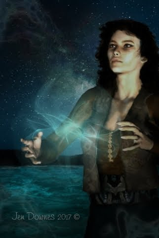


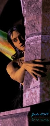


The vampire ... a new version of an old project, jacketing a book that's worn several covers across the years. It might ring a bell -- and if not, you may enjoy discovering it. This art is a contemporary spin on the old theme, using what I'll call "breakthrough color," a technique you can use to great effect in Photoshop. Here's how you do it:
Have your finished full-color art in the bottom layer. Make a new layer, and bucket fill it with a solid tone -- I used blue. This will make your art disappear -- but now, apply a blending change of "Color" (probably second from the bottom of the menu) to the bucket fill layer, and an opacity percentage of something like 40% - 60%, depending on how much color you want to take away from the original ... because as you drop the opacity of the solid, bucket-fill layer, your original artwork will reappear -- but it'll come back up in monochrome.
Now, you'll have a wall to wall monochrome image, and if this was what you want -- dandy. You're done. But if you want the "breakthrough color" effect, there's one more thing to do. Load up the eraser on the "brush" setting, and dial the strength way down -- 10% is fine, because this will give you the option of painting out a little of the blue bucket fill, or a lot. Stroke by stroke, just paint away the blue layer ... and as you do, the color of your original art shows through. Paint only where you want the color to show -- and with your eraser at 10%, you can maintain a very tight control over what's going to show.
It's a neat effect, and so simple.
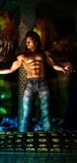
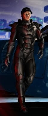
This is a fresh render: a more dramatic pose on the Michael character than in the original art, with new lights. I used two spotlights, one blue, one red, with shadows set to 100% soft ... just pulled them this way and that, rotated them around and around, till I got just the effect I wanted. Michael is wearing a new skinmap (H3D's Bart, from Renderosity), and the Danylel hair (DAZ marketplace). It's just a raytrace, because I knew so much overpainting was going to take place, the time invested in a LuxRender project would be wasted ... you wouldn't tell one from the other by the time I was finished vandalizing it. What makes it look better than the average raytrace is, depth of field is ON, and the virtual aperture is larger than the default value of f/22, which softens the image and gives it a more "real" feeling ... notice how his nose is in focus but his out-flung left forearm and hand fall out of focus, exactly as it would be in a photo taken in low light conditions.
I like this a lot. Now ... on to the next cover. About ten more to go, and this art job is complete. The only problem is, I need to be done by the weekend. Ouch. Fortunately, I managed to find the Wacom Bamboo nibs I needed at a store called Digital Camera Warehouse. Expensive: $22 for a pack of five, with shipping. But, what the hey? I've also ordered some from Hong Kong -- $3.50 for a ten pack -- but they won't be here till the end of the month, and I can't wait so long. It'll be interesting trying to make this current nib I'm using last that long ... it's going "scratch, scratch, scratch" on the tablet as I paint. Grrrr.