


 |
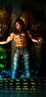
| LuxRender: Leaning on a Lamppost |
 |
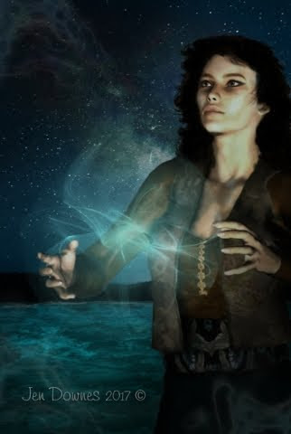
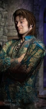
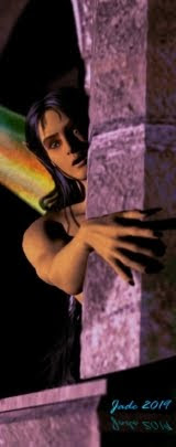
| LuxRender: Fallen Angel |
 |
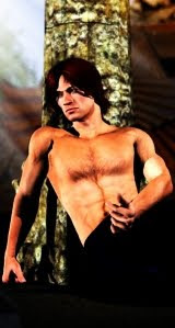
| Bryce 7 Pro: Forgotten |

...and LuxRender (or perhaps Reality) leaves the opacity map behind, your picture will actually fall apart at the most fundamental level. The answer to this question was -- don't fight it. If LuxRender is leaving the transparency settings behind, just set the whole thing in Reality instead --
And the only problem there was working out what in the world reality calls an opacity or transparency map. Turns out, in Reality it's called the Alpha Map. Aha. Once you know that, you're pretty much off to the races. The only chore left is numerous test renders to find out what percentage you need to set on the Alpha Map to get the effect juuuust right. The test renders can consume a lot of time ... roll on the next version of Reality, which will be seven times faster!
The next one -- "Fallen Angel" -- is a re-working of an old, old idea. I wanted to ee what LuxRender could do with it; and I wanted to see if I could just do it better in good old DAZ Studio itself. So I not only ran it through Reality/Lux, which you see above, I also ran it through Studio 3 again:

This one has different, subtle lighting and depth of field turned on -- you'll need to see it at much larger size to get the most out of it. Hmm. The truth is, occasionally good old DAZ Studio comes up with a render that's very good indeed, and some subjects suit the "artwork" type of render as much as they suit the more photographic treatment. Which is best? Well --
Here's the comparison; I leave it to you to decide:

Sometimes the "depth" of a picture only comes out when you see it at large size -- or if, during the course of working out composition, you add in, and take out, various elements to see what works best. In the third picture -- "Forgotten" -- which was done entirely in Bryce 7 Pro, the original idea was that this was a forgotten temple, overgrown and decaying, in the foothills of the mountains. It was going to be a mountain range in the background, dwarfing and overshadowing the man-made structure, which was falling into ruin. Then a better idea occurred to me. I took the mountains out and added this into the background:

A futuristic city shrounded in its own smog, where people are so absorbed in their high-tech lives that their own history is forgotten and decaying within sight of the city. This was the picture I wanted, yet it's very different from the one I actually set out to create. The atmospherics in this shot are what make it -- and Bryce 7 Pro lends itself brilliantly to dense, smoggy air and low, brooding skies.

Don't let this put you off: the model itself is terrific, it's just the catalog images that let it down. I've used the model several times; in fact, you can get your virtual camera right inside, and I used it as the stage for "The Man in the Hat." (The thing that I really can't believe was that that image was done over three years ago. Dang, where did time go?!)
Still messing about with digital painting (and loving it), an idea occurred to me:

It's a cloudy sky, turned upside down to get rid of the obvious gravity and distance effect of the right-way-up shot; then you drop it to grayscale and crank the contrast to make space BLACK. Then you can add some layers and paint in colors, which is pretty much what astrophotogtraphers do, since all deep-space images start life b&w. The big stars are Photoshop brushes; the small stars are just pale dots. Done!
I could get excited about this trick. Next time I need nebulae in the background for a space shot -- say, something for a Hellgate illustration -- I don't need to look at Hubble shots. Cool.
Still fiddling with digital painting, I was running every experiment I could think of in Photoshop, combining and re-re-recombining filters, to get an idea of their aggregate effects. Check this out:

You may have to see this at larger size to see what's been done. I dropped the old Tag Heuer commercial into grayscale, converted it to a sketch, recombined it, recolored it, and painted over the top with a variety of brushes for effect. The result --

-- is pleasantly weird. But even weirder is that the process took LONGER than some of the stuff I've done from scratch! So this is not something you could use to save yourself a lot of time in painting.
Lastly for today -- was playing with the DAZ Studio cartoon render settings:

It's a really neat effect, and too-often overlooked as we all scramble towards ever-more photographic effects. This is Leon and Iphigenia from a scene faaar down the chapter list in the Abraxas story. Yep, it was all plotted, miles into the future, and I did rafts of illustrations. What, you say -- write it?! Yes. Definitely. Starting to think seriously about that. Soon. Promise.