


Massive apologies for disappearing on you for a couple of days ... remember that Kreeping Krudd I mentioned last week? It seems to have turned into one of the many viruses from hell. It's the kind of virus that gives you a gut full of knives, the shivers at the same time as sweating, and when you actually can force a breath to the bottom of your lungs, it hurts, and you cough, which makes your back feel like you've been in the rack! Such fun ... and it's still romping through my system. So thanks for bearing with me while I get this together.
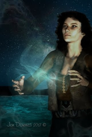
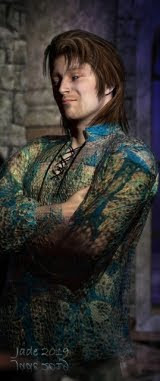
It's taken me about three days to finish the cover for An East Wind Blowing, which is Mel Keegan's vintage gay romance about two gorgeous warriors back in the days (the Fifth Century) when the Angles and Saxons were raiding up the coastline of England. So here you have Ronan, with the red curly hair, and Bryn with the dark smouldery looks. The book has just been donated by a member of MK's maliling list -- donated to be chopped out of its bindings and OCR'd, because it was published about 15 years ago (and written about 23 years ago!) and no electronic copy every existed, at least here. GMP Publishers Ltd. would have rendered it to a data file when the paperback was published, but that's a looooong time ago.
This makes the last of the classic Keegans to be released under the DreamCraft banner, and we'll be doing the ebook in June. So if a Celtic v. Angle Raiders gay romance with bags of panic and sizzling bits sounds interesting, you know what to look out for! It's going to Kindle, Barnes & Noble, iBooks, what have you, so you can't miss it.
Also, the last time I touched base here I promised to do a post about painting skin tones, and here it is...
NOTE: all images and guides are uploaded at 1:1 size, so you'll want to click to view (and probably save) them at full size. I'll go through the instructions at greater length, with more detail, in the text too, because (!) Google can't read images, and folks might be trying to find this via Mother Google. So, here we go:

Why would you paint skin tones in any case, especially on a render? There's a bunch of reasons. One is that a lot of renders can come out looking "plastic," and some painting on them makes them look "less fake." Also, all skin maps (for Michael 4, or Victoria 4.2, or any of the many 3D models) are not created equal. Some have their great points and their downsides too, such as veins in the temples which you don't want, or red patches, or uneven skin tones. Also, some skinmaps (especially for Michael 4) can start to show their imperfections in extreme closeup, though they look fine in longshot.
Now, it's very very true that it's the imperfections in human skin tones that make them look real, and you don't want to keep on painting and painting till you wind up with something that looks like you painted features on a hard boiled egg!! But on the other end of the scale you can also get a skinmap that's got a bit of "color flash," or else there are just too many imperfections. You can have an "Italian sausage" effect! This can also happen in photos of real live human beings, and a bit of airbrushing will make people look very much better.
You can also use these same techniques to paint out (or in!) dark circles under the eyes, baggy eyes, red veins, blue veins, wrinkles...!

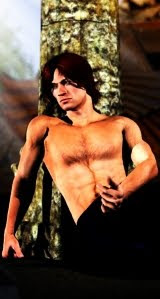
Here is a "before" shot, and even in this reduced form you can see the irregular skintones. At full size, this is really "troubled" skin, and if this guy were an actor, he'd be wearing a lot of makeup. And in many ways, makeup and airbrushing on photos/renders is very similar.
(I hate to tell you this, but in the days of yore, a Very Long Time Ago, I qualified as a makeup artist. True! I remember a brontosaurus coming right up to the salon windows and looking in, and we used to fight of the veloceraptors to get back to where the cars were parked...)

And here is the "after" shot, in which the skintones have been evened out. You could do this on the set with makeup, or you can do it after the fact on the images.
It's also well worth mentioning here that you can also do this exact same airbrush worn directly on the JPEG images which make up the skinmap, so that the next time you apply the "skinface" file, Michael 4 will come up looking as if he has nice skin (or a nice makeup job). Just be sure you don't overwrite the original file, because you might want it back ... and when you come to apply the newly-painted skinmap to the Michael 4 doll, you apply it via the Surfaces tab, by navigating to the folder where you saved the repainted "skinface" image. NOTE: if you do this, also be very sure you don't paint right down to the bottom edge of the JPEG, because then, when you apply it, you're going to see a "tide mark" where the "skinneck" image begins!! But if you keep your airbrushing well inside the periphery zones, you'll be fine.

Part of the real trick of painting skin tones successfully is in being extremely observant. Notice that natural human skin changes color through scores of subtle tones, about every half-inch across the face. One of the things that makes women look "made up", and which gets glamour the bad rep of beig "fake" is that makeup comes out of the bottle in one single color, and goes on over every square centimeter from hairline to collar bone, and it never changes color or tone. This might be fine, if you were painting a glam skinmap for the Victoria 4.2 doll, but for Michael 4, the skinmap wants to look like natural name skin, so it's a bit more difficult.
So, what you want to do is to sample the colors many, many times, using the color picker, and keep on changing the color you're airbrushing. So long as you remember to paint in many thin layers rather than trying to hose on one thick layer, the accumulation of color will look surprisingly good...
When selecting the color to airbrush with, use the "area select" tool, not the "point select" too. This should let you click on the color picker (looks like an eye-dropper) and then pull out a rubber box or circle (we used to call it a marquee) around a certain area. The tool will then give you the average color of the tones inside the box, and when you start to paint, you'll be hitting that average and making both ends of the scale come into the same color "zone."

So, having taken your average color pick, the next thing you want to do is configure the airbrush tool. This is the part I can't walk you through, not for love or money, because every interface is different! Best I can do is tell you what parameters you need to think about, and then you'll need to find them in your program.
Airbrushes work with a few tools which are common across the whole marketplace, and also right into physical airbrushes too. Brush SHAPE is the first. Stick with round. In all seriousness, a round brush is the easiest to work with here. Brush FEATHER is very important. Stick with 100%, as this blends the edges of the brush "stroke" perfectly into the background. Brush SIZE is just as critical, but I can't give you a number here, because this changes with every painting job. It stands to reason that if you're painting on a 300dpi image that's the size of a table top, you'll be working with a big brush, and if you're painting a small image, it'll have to be a heck of a lot smaller! Try to pick something that would correspond to about a centimeter, a bit less than a half inch, on the human face. Next, the MERGE MODE of the brush is important. Leave it set at Normal. It'll do all kinds of weird and wonderful things that are great for special effects, but you just want Normal here. (Mind you, the rest are a lot of fun to play with.) Lastly -- brush PRESSURE is the most important thing of all. The airbrush is one of very few artistic tools where you have to even think about how much paint you're pushing onto an image! Obviously, the higher pressures mean a lot more paint going through the brush; lower pressures make for thinner coats of paint -- you can control several thinner coats a heck of a lot more easily than you can control one thick coat, and as the coats build up, several thin layers look much more realistic than one thick one.
Below is a screen cap of what the tools look like in the interface of Micrografx Picture Publiser. I have no idea what it'll look like in your program, but the tools will be there. Any good paint program has to have them. If you don't have them, you probably need to get into a "proper" software to do this work -- and it doesn't have to cost a ton of money.

Now, there's another range of painting tools that you can look at, but I'm not going to go into them in any depth here, because only folks who're using either Photoshop or its open source, free cousin, GIMP, can use these tools. Paint.net, Micrografx and even the top of the line Corel Painter, will not give you access to these tools. They are, of course, .abr brush sets of (!) skin tones.
What they are basically, is close-up swatches of the details of human skin, such as pores, wrinkles and what have you. And you can get very, very creative with these tools, using them as subtle, subtle overlays after you've gotten the smooth-out painting finished. But if you're not using Photoshop or GIMP, you're sunk, so let's not even go there. (God knows, if I'd paid $699 for Corel Painter, and somebody rambled on about painting in the pores with .abr brushes, which are out of my ballpark, I'd be, um, a bit cross.)
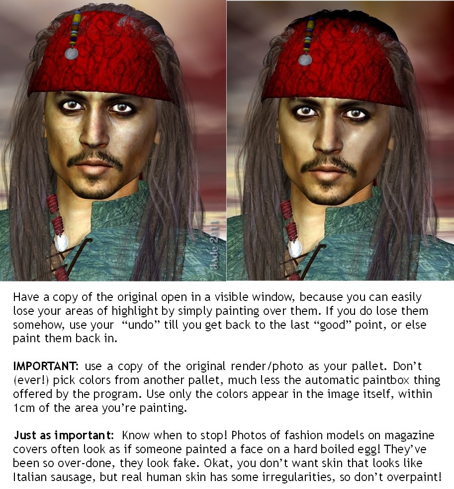
Color control across the whole image is vital. The best way to manage this is to have a copy of the original image open in a second, visible window. This means you can use it as a pallet, set up your colors from the original and then commence to paint on the in-progress work. Also, having the original open too means you can keep an eye on your zones of highlight and shade. It's very easy to homogenize the whole thing into flatness! Take care ... and if you do lose your highlights, use your "undo" tool to get back to the last "good" point. Or else, set the airbrush up from the original, and paint the highlights right back in!
Don't be tempted to use the "smear brush tool." Seriously. You're not finger painting her, and the smear brush tool just pushes existing colors around on the canvas. This is not what you want. Unless you're very clever with the smear brush, and use it sparingly, it'll jump out of the finished work like a sign saying, "Hey, look at me, I've been painted!"
Lastly ... in all seriousness, know when to stop! You don't want a finished image that looks like you painted a face on a hard boiled egg! You might get away with it if you're painting on Victoria 4.2, due to people's expectation that women will be plastered up in so much makeup, their own skin doesn't show through, and everyone's knowledge that makeup comes out of a single-color bottle. But for guys, well, this is ar from the effect you want. The Michael 4 doll is very, very natural. Some of the skinmaps are a bit "flat," and others might need a bit of airbrushing, but for the most part you'll be trying to keep that natural appearance of the "real" guy.
So there you go -- Painting Skin Tones 101. Have fun!
Jade, 1 June